Typography
As part of our brand identity, we use a consistent fonts, to help build regonsition for our brand. Typography enables you to create a particular context and have a certain personality.
Primary typefaces
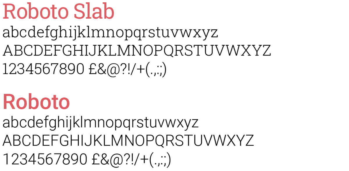
Our primary typefaces (font), should be used on all of our professionally printed communications and our website is ‘Roboto Slab’, for headlines, headings and pull quotes. And ‘Roboto’ for all main body copy and smaller text. Please do not use any other typeface in conjunction with our brand.
Designed by Christian Robertson The Roboto family is a modern, very legible and professional font that is completely at ease on all our literature and applications.
Important note:
Unless you know how to embed fonts, or your sending your document as a PDF. Avoid the use of Roboto for screen or digital-based applications such as, email signatures, PowerPoint or Word.
Downloading the Roboto family
These fonts are free to use and are licenced for use as OpenSource via Google.
Secondary typeface
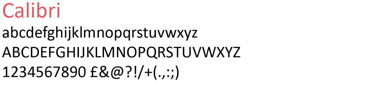
For any digital or screen–based applications such as Word, PowerPoint and Excel, our default font is ‘Calibri’, which is a common system font for Macs and PCs.
Tips for good typography
We want to ensure everyone can read our text clearly, regardless of who they are or what their ability may be
- Try to stick to three, or a maximum of four different sizes within your document so there is a clear hierarchy to your information
- Use headings that are bolder and maybe in a different colour to help people scan your copy / text
- Only use bullet points when you’re making clear points
- Always ensure that typography is laid out simply and clearly
- All body copy should be set ranged / aligned to the left and never justified
Accessibility
Our audience is diverse and wide spread, and some may have English as a second language so it’s important that our use of typography is clean, clear and easy to understand. For patient information, we’d suggest using a minimum size of 11pt for main body copy with a 2pt leading (line spacing).