Colours
For most identities, colour along with the name and logo, forms some of the most easily recognisable elements – especially if you use your colours as boldly as we do.
Primary colours
It might seem unusual to have black and white as colours – especially as they’re not technically colours! But for us they’re an important part of our brand toolkit. We always use our logo in black or white and we’re not adverse to using white space or black backgrounds in our communications. Communicating in black and white means we keep things simple, it’s honest and it helps us communicate with a level of authority.

Primary colour breakdowns
Black
C:0% M:0% Y:0% K:100%
R:0 G:0 B:0
#000000
White
C:0% M:0% Y:0% K:0%
R:255 G:255 B:255
#ffffff
Secondary colours
While these colours are secondary, and would never be used for our logo, we regularly use them in our illustrations and to highlight key points, statements and to communicate complex issues and subject matters. They’ve been created to stand out against our primary colours and to feel fresh, unique and complementary to our sector.
Secondary colour breakdowns
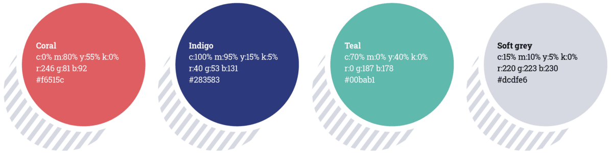
Coral
c:0% m:80% y:55% k:0%
r:246 g:81 b:92
#f6515c
Indigo
c:100% m:95% y:15% k:5%
r:40 g:53 b:131
#283583
Teal
c:70% m:0% y:40% k:0%
r:0 g:187 b:178
#00bab1
Soft grey
c:15% m:10% y:5% k:0%
r:220 g:223 b:230
#dcdfe6
Using other colours
We accept our partners and other organisations we work with can absolutely use their own brand colours. But we should never use their colours or other ad-hoc colours with our brand as that would dilute what we’re trying to achieve with our communications.